Point-of-purchase marketing & display: The role of graphic design and visual content
To convey a message, a mood or a ‘vibe’, point of sale vehicles create all kinds of signage or visual content at the heart of the point of sale, the ultimate place for purchase decision. Brands know that graphic design and visual content influence buying behaviour and brand perception. Explanations with examples.
1 400 words
In general, the purpose of instore marketing is to establish a fast, if possible emotional, connection between a brand and shoppers. By using various communications vehicles at the point of purchase (POP), such as display or merchandising solutions, marketeers induce or direct sales at the decisive moment of the act of buying.
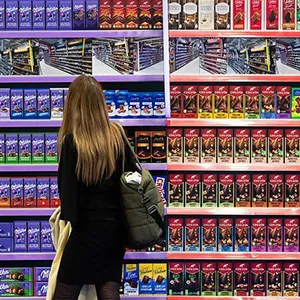
The potential is significant, especially for products which depend on purchase decisions on-the-spot. Regardless of the amount of out-of-store advertising, consumers still have to make the vast majority of purchase decisions in-store.
But shopping consumers have a lot going on. Often in a hurry, they can make split-second assumptions, almost automatically or based on a visual experience alone.
Some communication vehicles have the power to disrupt their habits and to attract them like a magnet to the location of a product or offer. To be effective, they don't need to shout. It’s all about creating that magical - yet complex - balance between product, branding, display, materials, color, and graphics. And then, the miracle happens: seeing is buying!
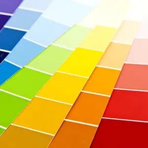
We’ve talked before about the role of materials and colours in POP display. To attract the attention, graphic design also plays a role in achieving this objective. Marketers manage this vector of emotions carefully to ensure that consumers see consistency. If the visual content looks sloppy, dull or off-brand, the shopper sees not mere than confusion.
For many years, various brand manufacturers have entrusted us with the design and realization of their POP display materials. With this valuable experience, we are delighted to share some considerations on printed graphic design, visual content and images for POP marketing & display.
Pilotes makes commercial furniture, display and merchandising solutions. We offer 100% customized point-of-purchase materials tailored to the in-store projects of brand and retail. Because we care about the climate and environment, we analyze the lifecycle of each project to avoid, reduce, and offset its impact 🌍🌿
Do you have a project planned? Contact us and let’s bring your vision to life together!
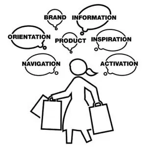
The goal of graphic design
A brand is more than a name and a logo. Often, consumers have been made aware of the graphic design associated with a brand. Marketers invest in out-of-store media to anchor these graphic elements in memories. Once in-store, the language, colours, fonts, shapes and symbols can refresh relevant memory structures and tempt consumers to the product, consciously or not.
Display materials receive prints on visible surfaces to convey a message, a feeling or a mood. All elements come together in a recognizable composition, or layout. Overuse of visual design is probably the biggest mistake. The physical product better takes away most of the attention. The shopper barely wants to interpret anything. He or she may walk away before the end of the story.
So, at the same time you’re developing your display, it’s important to think about the graphic design. And it's is only relevant if it drives the objectives of the display: information, education, conversion, market penetration, visibility or awareness, or direct purchase behaviour.
The 5 principles of appealing design
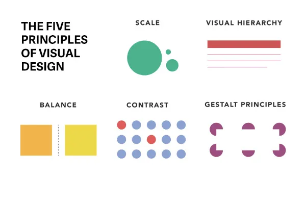
When looking at visual content, we can usually immediately say whether it is appealing or amiss. Five principles can make designs appealing:
✅ Scale emphasizes the relative size of elements to convey importance
✅ Visual hierarchy guides the eye to different design elements based on their significance
✅ Balance involves arranging design elements in a satisfying and proportionate manner
✅ Contrast highlights visually distinct elements to emphasize their differences
✅ Gestalt principles explain how humans perceive complex images as organized wholes
Understanding these five principles can significantly enhance your display design. By implementing these principles, your designs can increase usability, evoke emotions, and strengthen brand perception.
Visual hierarchy in store
In stores, visual hierarchy can also refer to arranging elements according to distance. The 10-5-1 rule may serve as a basis. At 10-meter visual elements achieve extra-visibility. They give a brand an edge over its competitors. If the advertising appeals to the shopper, he or she will approach it. At 5-meter, the elements inform or explain an offer. At a distance of 1-meter, they allow to scan an offer quickly or they make a complex set easy to shop from.
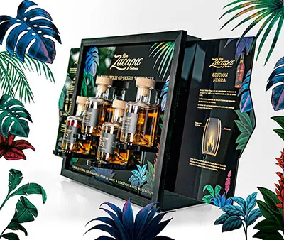
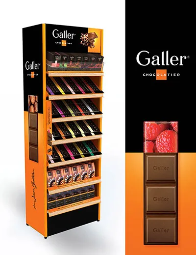
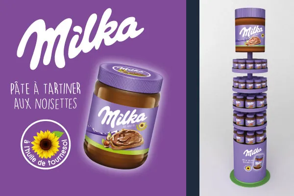
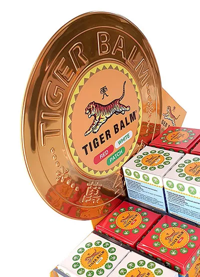
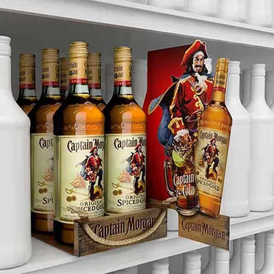
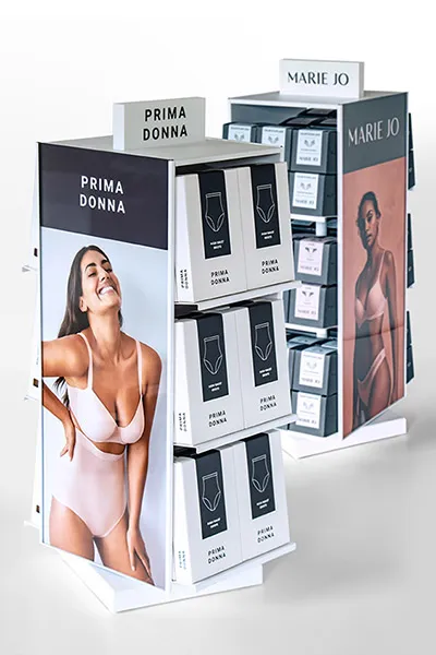
A typical stock-holding display can create several surfaces for signage or visual content:
- A top card, a show card or a front, is essentially the central point of interest from a greater distance on top of a display. It draws visitors to the offer. POS designers can be very inventive with this eye-catcher.
- A small card can be stuck on a shelf, for example to give a miniature sales pitch. There are also other solutions for creating a space for the hero of a range.
- Display price is the primary function of the shelf edge. But it can be used also for communication. The strip can be provided with printed visuals, to decorate, to inform or orient.
- A kakemono is hanging vertical banner placed perpendicular to the shelf, an effective way to grab the attention from passer-bye.
- Negative space gives space to breathe. By purposefully leaving blank spaces, graphic designers avoid chaos and clutter. This doesn’t necessarily imply emptiness. Color, contrast and texture can create décor to sustain the story of the brand.
- For more complex purchases, the displays can hold other materials with detailed information, such as flyers and leaflets.
In most cases, your graphic designer will provide the composition, sometimes based on suggestions from your display designer. Ready-to-print files and proofs are always based on the technical production file, which contains delivery specifications, such as:
- printing techniques, such as offset, screen or digital,
- dimensions,
- die-cuts,
- any hidden or less visible areas of printed components.
For permanent or semipermanent display, it may be wise to make the cards interchangeable. Card holders, envelopes made from transparent plastics, receive printed posters or strips. They extend display life after a campaign or an event. This allows a brand to own the space in store for a longer time. The same goal can be achieved with printed stickers or magnetic foils.
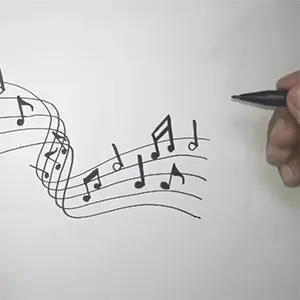
A picture is worth a 1000 words
It is true that complex ideas can be conveyed by a single image. Imagery is a rich source of information. However, there is an ongoing debate on the use of imagery in point-of-purchase marketing. Believers say that pictures are the best magnets for the eyes. That too is correct. According to others, they distract visitors from what needs to be done, explore the offer and make purchase decisions. They argue that today's consumer adopts a more defensive attitude towards advertising. Overly imposing brands run the risk of creating a black hole through which no communication ever passes.
The depiction of people is particularly controversial. Some brands avoid depicting a whole person. In an attempt to reduce the image to mere decoration, they depict only parts or "headless" persons. Some brands use illustrations of their mascot to still give consumers a sense of human interaction.
Consumers derive a lot of information from a brief glance at a human face. The personal characteristics of the models can certainly be useful to communicate a brand's target group. Or a smiling face creates confidence for beauty brands in the cosmetics or fashion category.
“The irresistible appeal of friendly familiarity cannot be underestimated", Leo Burnett
Every year, thousands of different POS displays are put on the market, some with, some without imagery or faces. But no concept is so exceptionally successful that it has become the standard. And so the discussion goes on.
When imagery can be perceived as too inciting or can have a negative impact on the consumer's reaction, POS professionals have more tools to achieve marketing objectives in the physical world of shopping, including language, graphics, color, shape, size, materials, texture, contrast, light, ... and, of course, the exaltation of the hero of any instore presentation, the product.
July 2022
Do you wish to develop a display or merchandising solution for you next in-store campaign? Reach out today. Together we will find the best solution for your brand.