How the colours of POP display
influence shopper behaviour?
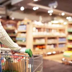
When consumers shop in a physical store, they focus on the visual experience and the presentation of the merchandise. Every effort is made to tempt the visual senses: shapes, materials, textures, contrasts, graphics, images, lights, ... Because the perception of colour requires little effort, it is the most direct vector of emotions.
The colours that caress our eyes influence our perception of things. Marketing is no exception! Colour is an essential element of any communication strategy and the values it defends.
Each colour is interpreted differently by our brain and therefore has a different emotional impact. Although symbolism can vary according to personal experience, culture, mood and style, there are some basic generalisations in the psychology of colours:
- red is stimulating and associated with activity
- yellow is the most visible colour and leads to feeling more energetic
- blue colours are seen as trustworthy and calm
- green promotes a sense of relaxation; it has strong associations with nature
- people often describe orange as happy and uplifting
- pristine white is associated with purity
- black inspires power and exclusivity
The reality is a bit more complicated, but one thing is sure: colours evoke a range of emotions that influence shopper behaviour. And they influence how attractive (or unattractive) an offer is to visitors.
The importance of a sophisticated colour palette for any POP campaign cannot be overestimated. And while they are one of the most obvious elements in any design, the right colours take on a powerful dimension when combined with the right materials in a presentation that reinforces the brand’s promise.
Related article > Material Options for the Design of your POP displayLet’s look at the impact of colour on POP display materials and how instore marketing specialists can benefit from it.
Pilotes makes commercial furniture, display and merchandising solutions. We offer 100% customized point-of-purchase materials tailored to the in-store projects of brand and retail. Because we care about the climate and environment, we analyze the lifecycle of each project to avoid, reduce, and offset its impact 🌍🌿
Do you have a project planned? Contact us and let’s bring your vision to life together!
Colours cause emotional reactions
Colour taps into the shopping brain to create the desired response. Colour is critical to the identity of an offer – creating desired associations and expectations, stimulating relevant memory structures, such as images, memories, feelings and emotions.
Ruby red and snow white, Neuhaus' window display presents the universe of products that are developed and sold for the festive season
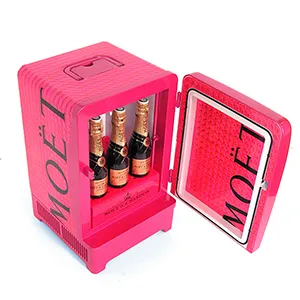
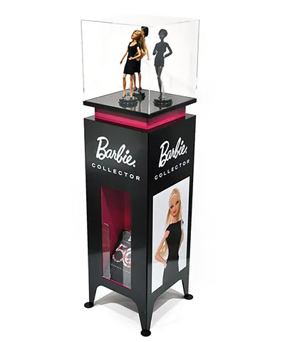
Is your product proclaiming exclusivity? If so, consider the use of golden accents, associated with status and superior performance.
Does your product promise craftsmanship or tradition? Then consider woody brown that exudes the aura of nature and ideas of experience and security.
Products with a modern, hi-tech look can combine lighter colours with grey metals to add a touch of sophistication.
Whatever the choice, with a clear, coherent and recognisable colour palette, a combination of matching colours that together tell the whole story, your display will not go unnoticed by the target audience.
Colours click the eyes first
Colour requires little effort to perceive. That is why consumers see it first. To make your offer stand out in physical sales environments, the use of colour (and light) is unarguably the most subtle, though powerful strategy.
Colour, vector of emotions, allows to set your offer apart from competing offers and to place it in its own story. Because colour is the first thing that shoppers notice, by choosing a recognizable colour scheme, brands emerge faster on the shopper radar.
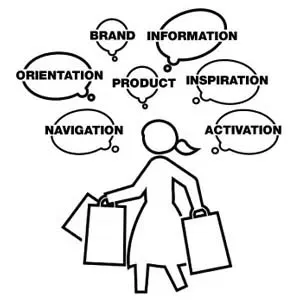
Colours help buyers find your offer
Shoppers are always in a hurry. Work and family, you know. They often have specific goals in mind. Meanwhile, a large number of messages try to reach their over-stimulated brain. They tackle this task with selective attention. They hardly want to read anything, nor process graphics, images, etc. They don't always consciously decide to navigate through a physical environment, nor to consider buying a product. Many impulses take place on an unconscious level. Initiatives are made instinctively, quickly and on autopilot.
A product that is not seen, by definition, will not be bought. The consumer will walk on if she or he doesn't recognise the brand or product at a glance. This is not the time for confusion. Visual continuity is essential: the right colour increases recognition. A well-chosen colour scheme, matched with the DNA of the product, can immediately immerse the shopper in the universe of your brand and brings a touch of authenticity.
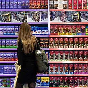
Colours grab shopper’s attention
One of the most important roles of colour in retail is to attract attention. In a space of ocular overload, between two competing offers, visitors prefer the product that catches their eye first and arouses their attention.
The best way to attract and convert customers is to surprise them with the power of colour. Imparting vitality to display, the right colour is the differentiating factor that can capture attention. Visitors make a judgement about an offer within mere seconds, and the majority of first impressions are made on colour.
The creation of a POP material allows for unrivalled creativity, a unique chance to innovate with eye-rubbing colour pallets. Your POP display is the expression of your creative force. Make it pop!
Colours clarify segmentations
Segmenting means expanding an offer to meet the diversity of demand. Meeting more and more needs makes purchase decisions difficult. Also, inconvenient, cluttered physical spaces require more cognitive effort and reduce buying intention. Chances are buyers get confused and walk away without buying anything.
Layout, or segmentation, is essential for larger sets. It helps shoppers to conveniently navigate and understand an offer - one of the basic rules of visual merchandising.
Organization and colours can improve the buying experience and shelf efficiency. Also, they can reduce time spent keeping shelves well-organised.
Related article > Visual merchandising in retail: the whisperer of temptationCommunicating with colours
Once you determine the colour palette for your offer, along with the other assets of your brand's charter, your POP specialist will source from your brand's DNA to reinforce the communication of your display.
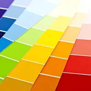
Design specialists have developed languages to communicate with colours. Several colour matching systems are used alongside each other. Let’s have a look at the 2 most important ones for the POP industry:
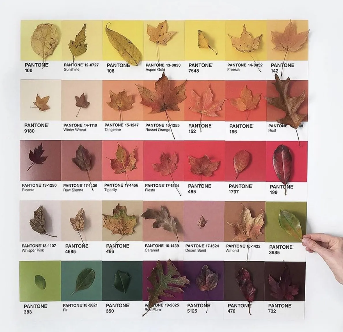
- Pantone provides a universal language for printed colours. Even though they may not speak the same language, marketeers can indicate exactly which colour they want – and printers know how to achieve it.
- The RAL model is the European system that defines colours for paints, coatings and plastics for architecture and industrial design. Currently containing 215 shades, RAL Classic is the most widely used system.
Manufacturers of coatings and materials can respond to these colour systems, together with their own colour charts, developed over the years according to fashion and preferences. Your POS manufacturer will make proposals according to the material, supplier, technical requirements, budget, etc.
It is worth mentioning here that the appearance of colour may change based on the material and surface on which it is produced. Shapes, textures, reflections, transparency and light can influence the experience. And some colours are not even achievable at all on certain materials.
Date: June 2021
Related article > How to Successfully Apply Colourblocking in Visual Merchandising ?Appealing display can make the difference between attracting a new customer or losing that customer to a competitor. Here at Pilotes, we believe in the power of premium display. Our 25 years of experience allows you to enhance the appearance of your offer in-store. Reach out today to set up a free consultation. We'll find the best solution for your brand.